Mapping trends in the distribution of COVID-19 infection in Ireland (MAPC19.IE). A secondary analysis of publicly available datasets.
Monday, 4 May, 2020
The above COVID-19 animation can be downloaded from (opens in a new window)here. To see the day-to-day change on COVID-19 infection in Ireland, click here. the Below is a racing bar chart showing the trends.
The report is available at .
The COVID-19 dynamic maps were produced using QGIS and the Time Manager plug-in. The data used in the mapping are made available by the Department of Health ((opens in a new window)https://www.gov.ie/en/campaigns/c36c85-covid-19-coronavirus/), which provides a breakdown of positive tests at the county level on a daily basis. For mapping purposes, these values are assigned to the center of each county and a proportional symbol is used.
The testing data that is made available indicates the number of positive test results on that date - it does not indicate the date of infection. Although the testing process has changed, the time lag between taking the test and getting the result suggests that the timeline is generally indicative of the spread of COVID19 in the population.
Although the number of positive tests are related to the size of population, this does not explain the patterns; 56% of positive cases are in Dublin county, which accounts for 28% of the state's population. The graph below shows the extent to which Dublin is an outlier.

Interactive 3D prism and other ways of mapping COVID-19
COVID-19 data is publicly available at the scale of the county (and Northern Ireland). Here I have taken the number of positive tests and standardised the data by population for each county. The dominance of Dublin is apparent in this 'prism' map that extrudes each county according to the value. The result is a three-dimensional image that you can rotate, pan, zoom and tilt. There are many ways of presenting the same data and the pdf document (Various ways to represent COVID-19 trends in Ireland using maps) shows five different types of maps. To interact with the 3D prism map, click here or on the map below.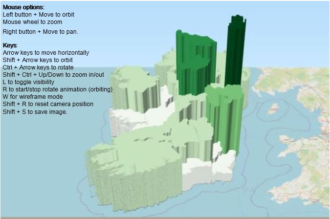
COVID-19 mobility
The map below shows the movement of vehicles on the road network on a typical weekday morning. The attached report (Traffic pattern during COVID-19) examines how the restrictions on movement have altered this map and the implications for limiting the transmission of COVID-19 in the population.

Traffic pattern around Easter weekend for Dublin
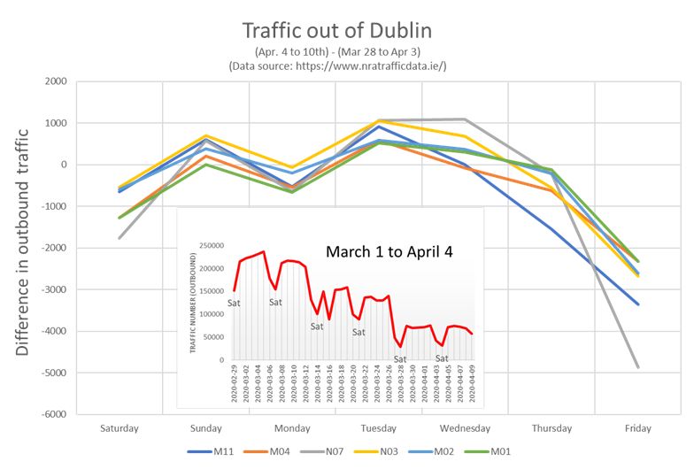
On March 28th, the Government issued a 'stay-at home' guide to the population to prevent the spread of COVID-19 that restricted the movement of most people to within 2km of their residence. To ensure compliance over the Easter period, on April 8th, the Garda launched an operation (Fanacht) that consisted of a series of checkpoints around the country that remain in place until Monday April 13th. The effects of these measures are evident in traffic data, which is automatically monitored by the National Roads Authority on major roads. In the graph, I have compared the week (April 4-10th) against the previous week (March 28 - April 3rd) and looked at all outbound traffic on major roads around Dublin. The inset graph shows the total outbound traffic since Saturday, February 29th, which shows the weekday-weekend movements out of the city - these numbers have been getting lower through March and then fell to a lower level again on March 28th, when the movement restrictions came into place. The effects of the Garda operation is seen in the fall off of outbound traffic that is clearest on Good Friday, when it was thought that there would be an exodus from Dublin to other parts of the country.
By Gerald Mills
Mapping trends in the distribution of COVID-19 infection in Ireland (MAPC19.IE). A secondary analysis of publicly available datasets.
Monday, 4 May, 2020