What is data visualisation?
Data visualisation (“data viz”) includes a wide range of techniques for the visual representation of data and information. With links to graphic design, computer science, psychology and a range of other disciplines, data viz helps users to explore and comprehend large amounts of information quickly.
Fundamentally, it is about making research more accessible by communicating complex data in a format that helps the reader understand what the data represent. Used correctly, this is one of the best tools for highlighting relevant information to your audience.
There are two main types of data viz: exploratory visualisation and explanatory visualisation. Simply put, exploratory visualisation is used to help figure out the story the data is telling you, whereas explanatory visualisation is used to tell the story to your audience. Your first question in data visualisation is to determine if you are designing to explain or explore the information you’re presenting. An example of each is given below:
Exploratory data visualisation
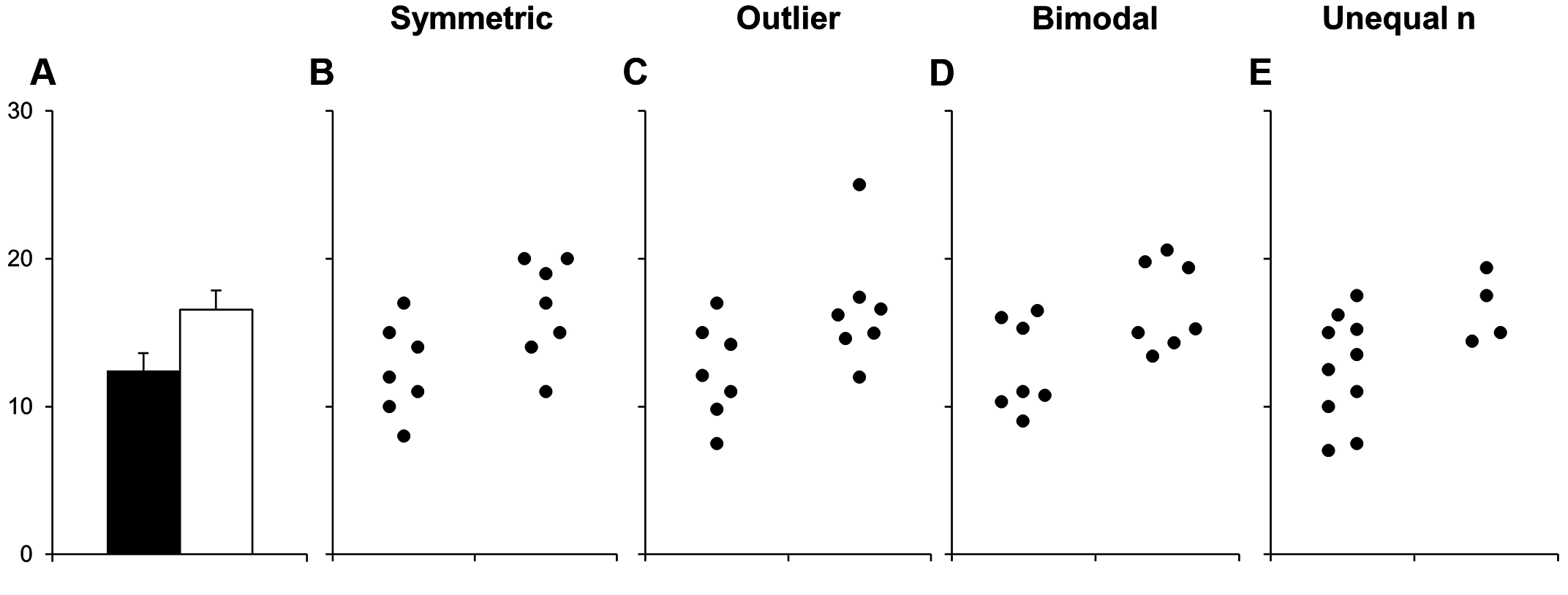
Exploratory data viz is used to make sense of data by visualising trends and relationships. It is used to understand how the data are organised, distributed and shaped, and to explore potential underlying patterns. This type of data visualisation is typically used as part of the data analysis phase.
In the example here (from (opens in a new window)Weissgerber et al. under a CC-BY license), each of the four data sets (B-E) can be accurately represented by the same bar graph (A). This demonstrates how choosing the incorrect visual (the bar graph) can obscure important details about the data, possibly misleading readers. Be careful not to mask details behind summary statistics.
Explanatory data visualisation
Explanatory data viz is used to communicate findings and insights. It focuses on presenting the important findings of your data and typically has little to no analytical value. There is editorial decision-making as you decide which information stays in, and which information is unnecessary to highlight the key insights.
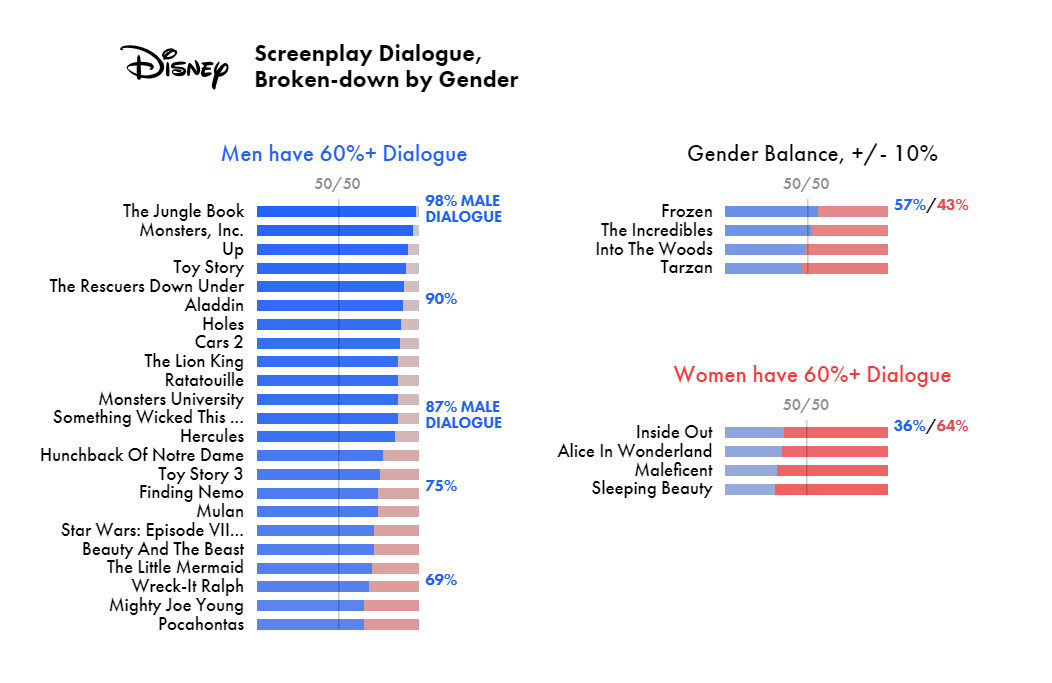
The image beside, from (opens in a new window)The Pudding, shows Disney screenplay dialogue, broken down by gender. In a study of 30 disney films, 22 have a male majority of dialogue. Even films with female leads, such as Mulan, the dialogue swings male.
Explanatory data viz can communicate data like these in a striking way. For another example, check out XKCD's representation of the (opens in a new window)relative depth of lakes and oceans. Perhaps the most famous example of a complex story told in a single graphic dates back to 1869, with Charles Joseph Minard's cartographical depiction of the losses suffered during Napoleon's Russian campaign of 1812 ((opens in a new window)here it is, translated into English).
What does good data visualisation look like?
Data viz should help the reader understand the data. When designing, you need to ensure that everyone viewing the visualisation will be on common ground about what it represents. Different audiences may read and interpret information differently. An audience of experts, for example, will have different expectations than a general audience. Consider what type of information is most useful to your audience. Then consider the functional role of visualisation. To use data viz to its full potential, you need to understand both your data and your audience.
A key resource here is the (opens in a new window)Data Visualization Catalog, a comprehensive library of different information visualisation types – from line graphs to radar charts to heatmaps – developed by Severino Ribecca. It includes a useful guide of charts categorised by data visualisation functions and audience communication goals. For each type of visualisation, it also suggests tools that can help you make them.
Creating engaging and usable designs can be challenging. When making design choices, the HATS acronym can be useful:
- Headings can promote easy navigation of a visual.
- Access refers to the visual cues that help a reader navigate and understand your visual.
- Typography promotes ease of reading and understanding the hierarchy of information.
- Spacing refers to positional design, which helps focus the eye of the audience.
Accessibility
Designing with accessibility in mind will make your data visualisation an equitable experience for users of all circumstances and abilities. The World Wide Web Consortium (W3C) developed a set of accessibility benchmarks called the (opens in a new window)Web Content Accessibility Guidelines (WCAG).
Visual accessibility
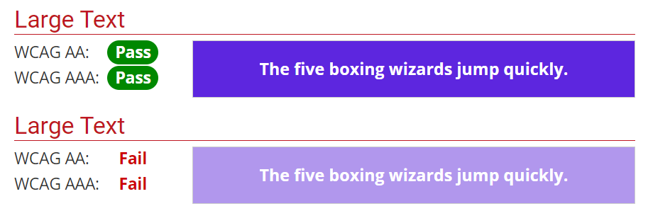
You should also consider visual accessibility. There are two types of contrast: brightness and colour. The highest brightness contrast is between black and white. Complementary colours have the highest colour contrast. However, contrasting full colours have no brightness contrast and cannot be discriminated by colour blind people. Thus, you should not rely on colour alone to differentiate information. The main contrast should come from brightness and not from colour. There is a range of helpful online tools that can help you choose accessible contrasts.
Here's a sample output from a contrast checker. The top panel has a high colour contrast ratio and meets WCAG colour contrast accessibility standards. The bottom panel does not have sufficient contrast to meet accessibility standards:
Misleading colour scales
Rainbow colour is often the default scale for many data visualisation applications. However, people see colour in terms of hue, saturation (or intensity), and lightness (how much white or black is mixed in). Humans do not perceive all colours uniformly and the transitions between some colours on the rainbow spectrum appear gradual, while other changes seem much more abrupt. Furthermore, the perception of a colour can be influenced by other nearby colours. This can lead to incorrect assumptions about the underlying data being represented and introduce bias. A number of (opens in a new window)alternative colour scales have been developed to minimise this unintended bias, but these are often not the default scales on data visualisation software.
Things to do and things to avoid
In general, follow these rules of thumb:
- Do: directly label your data.
- Avoid: only using legend labels.
- Do: separate elements with whitespace or a pattern.
- Avoid: relying on separating data based solely on contrast between colours.
- Do: show the output at all times.
- Avoid: using complex tools like hovering (where information information displays when the mouse hovers over the diagram – it makes machine reading difficult and may be hard for low-vision users to interpret).
- Do: check that the visual is understandable within 5 seconds or so.
- Avoid: using visual aids that are more complex than your writing.
- Do: use your diagram to accurately and honestly represent your data.
- Avoid: inflating trends, data points, results, or scale with visual tools.
How can I make one?
There are a number of resources available to help you create or commission great data visualisations.
- (opens in a new window)From Data to Viz leads you to the most appropriate graph for your data, links to the code to build it, and lists common caveats you should avoid.
- (opens in a new window)The Data Viz Project organises visualisations by type, function, shape, and the input required.
- (opens in a new window)The Data Visualisation Catalogue categorises visualisations by function and audience communication goals, and suggests tools that can help you make them.
- (opens in a new window)UCD Library’s Visualisation Tools LibGuide includes links to software and tools for researchers.
UCD Library guides on GIS and mapping
UCD Library has developed extensive expertise in Geographic Information Systems (GIS) and visualising data using maps. For help and further information, see the LibGuides on how to (opens in a new window)Show Your Data on a Map, and on (opens in a new window)GIS at UCD and on the Web: ArcGIS. See the short video from UCD School of Geography (right) demonstrating how GIS can be used to visualise information and help make better decisions.