As the COVID-19 spread across the globe in the early months of this year, people all over the world started to look for information about the disease. Facts and figures were quoted across media outlets and comment sections with people drawing conclusions as to which countries were more or less effective in their public health policies. All of this led to furious debates as to what restrictions would be more or less effective and which countries had been ‘successful’ or had ‘failed’ in their measures to spread the virus.
Very quickly, however, the conversation grew beyond the numbers. Different countries were collecting data in different ways, and testing regimes were impacting hugely on reported case numbers. People started pointing to differences between demographics, geography and cultural norms, which could be impacting on the virus’s spread.
In short, the rest of the world got a crash course in the problems that data scientists have been facing for years; incomplete data sets, noisy data, and unknown variables.
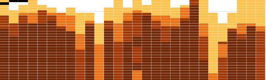
UCD’s Professor Barry Smyth has been publishing regular blog pieces on medium.com which grapple with these issues of data problems and less tangible factors which might be affecting the spread of the illness in different countries. Professor Smyth has explored the figures around coronavirus, suggested which ones are the most useful and put together a huge number of visuals to help get our heads around a rapidly evolving situation. He has shown how different countries have accumulated cases, and correlations between (opens in a new window)age and hospitalisations in Ireland. As well as getting clear, up to date information as to how individual countries are doing, we are also getting short, simple explanations of data visualisations and, in particular, how to use charts and graphs better to get an idea of the spread of the disease. For example, his ‘Drip Charts’ show clearly where the rate of infection has begun to slow, where other charts would still show an increase in cases. Both are accurate, but the drip chart helps us to understand (opens in a new window)if the situation is improving or not; crucial information for people who need some encouragement in this time of massive social upheaval.
More recently, Professor Smyth has proposed a model that he argues allows us to compare lockdowns between countries more effectively. This model relies on mobility data, rather than simple dates of lockdowns, which vary in their restrictions from country to country. It tracks mobility from the day in which a country recorded its hundredth case and divines four separate stages, calm, drop, hold and bounce. The mobility data was tracked alongside case numbers initially, and then with estimated Rt to show exactly (opens in a new window)where each country stands as it continues its journey through the crisis.
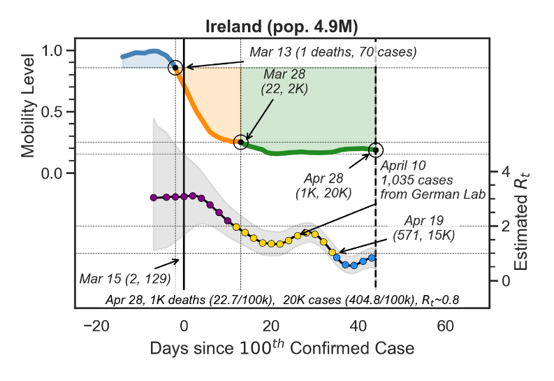
The data is not perfect though, and in every piece, Professor Smyth brings us through his process, highlighting limitations or uncertainties as he goes, while discussing the pros and cons of using one metric or visual over another for better clarity. He explores why the data might be different across countries and what social or cultural issues might come into play. Even with these complicating factors, he shows us that some analysis can be effective when it comes to helping us understand what has been happening and what the future might hold.
And if you already knew the difference between linear and logarithmic scales, then there are a couple of (opens in a new window)deep dives into coding and data visualisation, just for fun…
Professor Barry Smyth is Digital Chair of Computer Science at the School of Computer Science, UCD, and Founding Director, Insight Centre for Data Analytics. He publishes on his research at (opens in a new window)https://medium.com/@barrysmyth